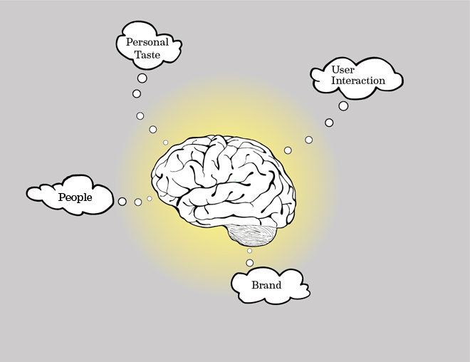
04: designing for Personal Taste by Damien Vizcarra

Guest contributor: Gregg Flender

Each year, design schools produce a new crop of students. All of them have been steeped in the modern design tradition and exposed to the tenants of good design: “Less is more,” “form follows function,” and “keep it simple” are the mantras we all chant. The modernist aesthetic embraces the idea that the best designs are those that have been distilled down to their purest form so that they become the boldest expression of the idea.  That said, much of this effort may be lost on the consumers who don’t share the same sensibility for simplicity.  Focus group testing, low sales numbers, and our own consumer research confirm that the majority of consumers prefer designs that have more “flair” and are more “sleek” to those that are exercise restraint.  Very often the preferred directions are in complete contrast to the good design principals we learned. But what is good, and who gets to decide? Is it the market, or is it a team of other designers who panel design award competitions?

When good design is in conflict with the market
What schools teach as good design may seem to be out of step with the average consumer.  Product designers may find themselves having to make a choice between creating something that sells or creating something that will win design awards.  Ideally, we design products that do both successfully.  Apple seems to be one of the few exceptions where simple designs that would make even Dieter Rams smile still appeal to the masses.  It’s validating to the profession that people are so emotionally connected to Apple products that they’ll stand in line for hours to buy one—even in the depth of a recession. Are people who buy Apple drawn to it because of its simple, modern design? After so much thought and attention to detail went into every product, it must make Apple designers cringe by the reality that many of the people who buy these beautiful products also embellish them in bedazzled cases. These cases become part of the way people express their personal taste. Humanizing what many non-designers might perceive as a cold modern aesthetic. Part of the success of the product design's simplicity is that it becomes a canvas not just for the UI, but for the embellishments as well. This aspect of its simple product design may have made it more palatable to the average consumer.

Ask or Tell?
The good news is that you don’t have to sell you soul to create compelling designs that appeal to a broad market.  The goal of testing ideas and prototypes with consumers is not to get the answer straight from the source.  It is not about seeking a prescription for successful design.  Rather, it is to prompt a dialogue that will feed into our creative thinking and possibly disprove misguided assumptions before a bad review can ever be posted to Amazon.  The role of a designer is enhanced by the world we interpret around us, but that interpretation is still reliant on our ability to skillfully translate the right answer with good taste, sound judgment, finesse, and yes…our “gut.”  The tried and true values taught in design school still apply.

How to appeal to the tastes of the consumer while leveraging the benefits of good design principles:

Create something with a clear focus.  If it can’t be less, then make more successful by creating clear visual hierarchies.  Even though the forms are complex, they are cohesive on this shoe that is expected to live in a high performance ca…

Create something with a clear focus.  If it can’t be less, then make more successful by creating clear visual hierarchies.  Even though the forms are complex, they are cohesive on this shoe that is expected to live in a high performance category. Color helps lead focus to the area that is most important to see. 

Communicate the message through the form.  Whether it says something about the way it is used or what the brand stands for, it can be done in many different styles that fit different individual tastes.

Communicate the message through the form.  Whether it says something about the way it is used or what the brand stands for, it can be done in many different styles that fit different individual tastes.

Avoid fashion and trends.  If the form is an outgrowth of its function, its personality will allow it to live alongside many different aesthetics.

Avoid fashion and trends.  If the form is an outgrowth of its function, its personality will allow it to live alongside many different aesthetics.

Textures and patterns have been used a lot recently because they allow for surface richness on simple, strong forms.

Textures and patterns have been used a lot recently because they allow for surface richness on simple, strong forms.

We aren’t designing for ourselves.  It’s about the consumer, their sensibilities and their values. Even if the target user's “taste” falls outside our own, we leverage the principles of good design to connect.  We all speak design but not all speak it in the same way.  It’s a language that can be crafted to say what we want it to say to the people who we’re trying to connect to. Using form to say something about the brand or product benefits can happen in many different flavors, some which may fall outside our own personal tastes. The role of the designer is not to be the purveyor of good taste.  Rather, we use our craft to connect our products to the people who use them. It’s much more difficult to create a design that speaks to someone outside our own personal tastes, but still benefits from the principals of good design.

Source: http://continuuminnovation.com/04-designing-for-personal-taste/ 

03: Why Do We Love Inanimate Objects? by Damien Vizcarra

03_consumers.jpg

Guest contributor: Kevin Young

Ever wonder why you have such a strong emotional connection to objects? Why do you love your car, your headphones or even your favorite pen? It’s probably because a lot of thought went into the design of that product to ensure it would evoke the right logical and visceral response from you.

Think of it as a war going on in your brain.  Although it is an oversimplification of cognitive science, it is a commonly held belief that various “areas” (not literally physical areas) of your brain will process stimulus in different ways. There are areas of your brain that are more deliberate in their processing of information. This deliberate brain allows you to make thoughtful, purposeful and often rational decisions. Opposing this is your instinctive brain. The instinctive brain responds more quickly and viscerally to stimulus. This is often without your conscious awareness.  And these two areas of your brain occasionally don’t get along. Your instinctive brain might want you to buy that amazing $500 pair of shoes but your deliberate mind reminds you that you’ve already maxed out your credit cards and a $50 pair of shoes will suffice.

The best products – the ones that cause us to fall in love with them – accomplish the elusive goal of getting the opposing forces of your brain to call a truce. They are logical enough to be useful in your life while also satisfying you viscerally.

To dig deeper, let’s first look at what we’re calling your deliberate brain. Our deliberate mind reminds us that we all need things to fit into our lives to perform a task. Even the simplest of objects (such as your beloved pen) have been carefully researched, designed and engineered to fit into your life and make your life better. When things work well, and fit you well, the deliberate part of your brain tells you that you like it - and you start to create a connection with the product.

But then it gets really interesting when we consider how the instinctive part of your brain is involved. This doesn’t follow the boring rules of the logical and deliberate part of your brain. Many of these drivers and motivations are triggered by things that are subconscious. For example, have you ever wondered why you love the look of certain types of cars? This is likely because significant effort was made in designing these cars to look attractive to you. As humans, we’re naturally drawn to faces. We can’t help but see a facial expression on the front of a car.  For example, a Mini Cooper is intentionally designed to have a happy facial expression to communicate the fun and free-spirit nature of the car. Conversely, a BMW is intended to appear strong and powerful – therefore having a more serious facial expression.  

consumers_joey faces.jpg

And this phenomenon isn’t limited to cars. All things around us communicate a message. Consider this soap bottle. At first it just seems like a simple, unique shape for a bottle. But what this object is communicating to your subconscious is fresh and natural. How? The shape of the bottle intentionally mimics that of a pear. It’s not literal and not meant to make people conciously think that it looks like a pear. Instead, it’s intended to trigger the appropriate responses from your subconscious to make you believe the promise that this is a natural product.

consumers_method soap pear.jpg

The examples go on and on. Computers that are meant to evoke happiness, sneakers that add spring to our step, vacuum cleaners as powerful as jet engines. We’re surrounded by things that were strategically created to subconsciously evoke an intended message from the instinctive part of our brain. 

consumers_flower pot_jet engine.jpg

And this doesn’t happen by accident. Significant effort is made in researching, designing and testing the objects that are around us. Teams of people with training in design, marketing, ergonomics, and engineering spend time ensuring the objects they’re creating speaks to you in the right way.

So, why do we love inanimate objects? There’s a silent battle going on in your brain. Few products or services manage to adequately appease both sides of this conflict. But, when something does manage to satisfy both deliberate needs and instinctive desires, we can’t help but fall in love.  So go ahead and hug your favorite pen and tell it how you really feel.

Source: http://continuuminnovation.com/03-why-do-we-love-inanimate-objects/

02: Five Guidelines to Make Product Experiences Instantly Gettable by Damien Vizcarra

02_user interaction.jpg

Guest contributor: Jake Childs

The product opportunity had been unearthed, its market potential established. Now it was time to fully define the experience. The designers rolled up their sleeves. It was a seemingly simple consumer product, requiring the user to load two disposable parts that would get used up after some period of time.

“Prototype to learn,” was their mantra. The designers created a handful of compelling concept architectures then generated physical, experiential models. As they began to interact with the models, they began to identify favorites (they couldn’t help themselves). “This one is obviously the easiest to set up and load,” decreed one designer. Another expressed, “but that one is the most familiar interaction,” comparing it to a common artifact. After some healthy debate, they were confident that they already knew the best path forward. It was a simple product after all. But, like any good designer, they knew they needed the perspective of the target user.

They put the experiential models in front of potential users, asked questions, and observed. To their surprise, some of the things they were certain were obvious were not; and for good reason. But this was the point – learning so they could begin to refine – in the quest for instant get-ability.

These surprises are not uncommon. At Continuum, sometimes our clients are looking for ways to improve their product incrementally. Other times we’re inventing the interaction for a totally new offering. In both instances, the goal is to arrive at “intuitive”. Through our experiences, we’ve gained insights into defining the best user interaction in pursuit of the intuitive. Here are five things to consider that we’ve learned along the way:

1. Alleviate Friction Points. We’ve all been there: That new product arrives, the one you’ve been so excited to receive. You pull it out of the box, go to set it up and…wait…how do I…where does this part go? Nope, not there. What about…no? Ah! Frustration invariably sinks in.  A friction point is anything in an interaction that causes confusion, frustration, or a lack of confidence that you’re doing things correctly. Clearly, in order to create an intuitive interaction, you have to identify and eliminate the friction points. Observing where people get lost in the task, simplifying procedures, and differentiating parts all play into alleviating friction points.

2. Create Action Possibilities. Buttons that look like they can be twisted. Tabs that look like they can be pulled. Action possibilities are latent cues that, well, indicate the possibility of a certain action. They invite you to touch, pull, twist, push…to do something. They can be subtle, harmoniously fitting in with an aesthetic design, or they can be a focal point, blatantly indicating where someone needs to take action. Either way, action possibilities are a powerful vehicle in influencing someone to lift here or twist there.

3. Utilize Continuity CuesContinuity cues are visual indicators that suggest two parts belong together. They consist of shapes or visual elements shared across two separate parts. Matching shapes that allow the parts to nest, shapes that key into one another like puzzle pieces, matching color markings, complementary patterns, and the completion of a shape when parts are joined are all examples of continuity cues. 

4. Provide FeedbackFeedback is not an unfamiliar concept. But it’s surprising to see how often it’s overlooked in product experiences. Feedback is a reaction that communicates the status. It may communicate that a part is placed correctly or it may communicate that things are ok from a distance. It can be visual (a light blinks), tactile (a vibration, perhaps), or audible (a “click” when something is positioned properly). Feedback instills confidence that a task was performed correctly and that things are in place. In the case of a disposable, it’s also a valuable tool to indicate when it’s used up and ready to be replaced (think the moisturizing strip on a razor). Without the appropriate feedback, a user may suffer from a lack of confidence that a task was performed correctly or continue using something past expiration.

5. Assure DifferentiationDirecting an end user to know where not to interact is just as important as directing them to know where to interact. A common friction point that’s worth calling out as its own guideline is a lack of contrast or differentiation. This is particularly crucial in situations where there are removable parts and multiple interaction possibilities and getting things placed correctly is critical for the product to function. Utilizing visual and form cues to say, “interact here, don’t interact there,” all aid in making the product experience intuitive, removing any confusion or frustration.

Consciously considering these five guidelines as you create your next product experience will streamline your path towards creating instantly gettable products.

Source: http://continuuminnovation.com/02-five-guidelines-to-make-product-experiences-instantly-gettable/

01: I Want My Air Jordan's Back by Damien Vizcarra

01_brand.jpg

by Damien Vizcarra

It was late 1985.  I was 10 years old.  I wore a size 7.  Nike had just released a shoe called Air Jordan’s named after an up and coming basketball player fresh out of the University of North Carolina.  My mom bought me a pair of these shoes and it was the coolest thing she ever gave me.  There were other products that I coveted before during my first 10 years of life, but nothing like this.  This was the first time that a brand actually spoke to me.  Wearing Air Jordan’s, especially the first release, was the pinnacle of cool among my young peers.  I wanted to be like Mike.  Everyone wanted to be like Mike.  Owning those shoes meant that you owned a part of the MYTH….this guy that could fly, this guy that won slam dunk championships, this ultimate competitor.  I loved my shoes, but when I was in high school I met a guy that loved them more than I did because he gave me $300 to buy my Air Jordan’s used!  $300 is a lot to get for a used pair of shoes so I took him up on it.  At the time I had a feeling that I might regret it and I do.  Those shoes and that brand represented a certain careless time in my life.  Michael Jordan turned out to be legendary, and for Nike, Jordan went on from being an interesting endorsement to a brand that has spoken to peoples’ aspirations for the last 28 years.  I, at one time, owned a part of that brand. 

There is a lot I think about when I start designing.  Brand is amongst the top of that list.  As designers, we are all in the business of understanding people.  It is through informed designed that we can connect companies and their brands to the hearts and minds of consumers.  So as I put pen to paper, I’ll ask myself how I can make that connection.  How will whatever I’m designing be just right for the brand, yet be fresh, new, and somewhat unexpected?  Can I design something that will be uniquely ownable for the brand that no one else can claim?  Through the course of the last 10 years, I’ve been fortunate enough to solve design problems all over the US, Europe, and Asia.  I've noticed that in all these places, despite the cultural differences, the power of brands and the universal lust that people have for them is exactly the same.  After all, a brand is an association people have with a product or service.  It can be symbolized by a badge, a slogan, design queues, look, feel, smell, shape, sound.  Some people treat it like a belief or a relationship, even an expression of who they are, but…it’s all in your head.  Brands are nothing more than impressions.  They are impressions that elicit an emotion response. Impressions that are made in peoples’ minds and ideally are fostered and preserved over time.  A good brand grows and evolves with their audience.  

So how are impressions formed?  Simply put, impressions can be formed by a message.  For instance, let’s take In-N-Out Burgers.  The message is quality and freshness. It’s their brand pillars which represent everything they stand for since they opened 1948.  A lot of people don’t know this but they opened around the same time as McDonalds (another strong brand) but they took very different paths.  While McDonalds grew its identity all over the world, In-N-Out stayed strong by staying small.  They kept they menu unchanged, low priced, and quality and freshness high.  They let people define items that ultimately became their secret menu.  Through their message and impression, In-N-Out makes people feel like they are a loyal part of the club. 

Some brands can be like people and take on their own personalities. Audi achieved this with the headlights of their cars.  In the dark, all cars look the same.  Audi, staying true to their promise of Truth in Engineering, created a simple signature element.  The strip of LED headlights is an ingenious design detail that gives their cars, and more importantly the brand, a recognizable personality all its own. Since then, this detail has been borrowed by other auto manufacturers, but everyone will always attribute it to the brand that started it.

While impressions are created by companies, it is people (consumers) who give it meaning.  People are responsible for building brands and good brands listen. By listening, they know you and they know what you like.  They figure out ways to deliver on what resonates in an authentic way.  Here are some guiding principles that a designer can use to embody a good brand experience:

Keep it simple
It is kind of the golden rule for a lot of things, but getting to simple is often the hardest thing to do.  It’s important to the keep the message simple, concise, consistent, and undiluted.  There are two factors to consider: the brand and people.  The space that connects them is the Brand Experience.  This is where values, culture, wants, and needs all interact together.  Those interactions are comprised of a series of touchpoints; encounters that people have with the brand.

brand touchpoints.jpg

These common touchpoints are where people interface with a brand.  Collectively, these touchpoints inform people’s perception of a brand and individually have the power to be positive, negative or neutral in nature.  As a designer, it’s a lot to consider.  It is also important to understand that we don’t own the perception, but we do influence it through design.

Tell a good story
Good designers are masters at telling stories.  Designers tell stories through their medium like the way a director shoots his vision in a film, the way an author tells a story through writing, or the way a composer creates a sequence of sounds that alters your mood.  Good designers are the curators of these experiences, and they help deliver a brand’s message.  But the story you tell, whether it’s through form, materials, user interaction, out of box experience, or all of the above, must be true and believable.  If not, people will call out the brand because they are too informed and can sniff out inauthenticity when they see it.

With this in mind, I’m ready to put pen to paper.  After breaking down the brand, simplifying the message, formulating a story, and blueprinting our attributes, we’re finally ready to create.  Design, through the lens of a brand strategy, means controlling your message across touchpoints to make a meaningful impression.

Source: http://continuuminnovation.com/what-does-a-designer-think-of-1/