08: NIKE HERITAGE by Damien Vizcarra

FINAL_Nike glam.jpg

Every once in a while I’ll go through my watch collection and this timepiece makes me pause every time. I usually tout my Ikepod Megapod or Junghans Max Bill Chronoscope as the heroes of my collection, but when I look at this piece I am reminded that it is by far amongst my favorites. It’s one of those pieces that has everything an enthusiast loves about a watch all in perfect balance: craftsmanship, uniqueness, function, and style.

This is the Nike Heritage. It originally retailed for $250 which is hard to believe given the high level of build quality. Needless to say it has tripled in value so I am really glad I acquired it when I did. One of the first things people notice about the watch is how the leather strap is shaped to seamlessly blend into the body of the housing. It is an incredibly striking detail. Given the complexity of leather forming and slight imperfections, it assures you that a machine did not conjure up this marriage of materials.

FINAL_strap construction.jpg

Another detail I love is how timer feature completely ignores the placement of the numerals at the 7 and 8 o’clock. This detail is the type of visual cue common in active and performance wear and a subtle reminder that Nike is about sports. The designers could have figured out a way to neatly fit every graphic on the watch face in a conventional way but no, we’re Nike, we’re bad ass, no ‘40’ for you son.

FINAL_Dials interrupted.jpg

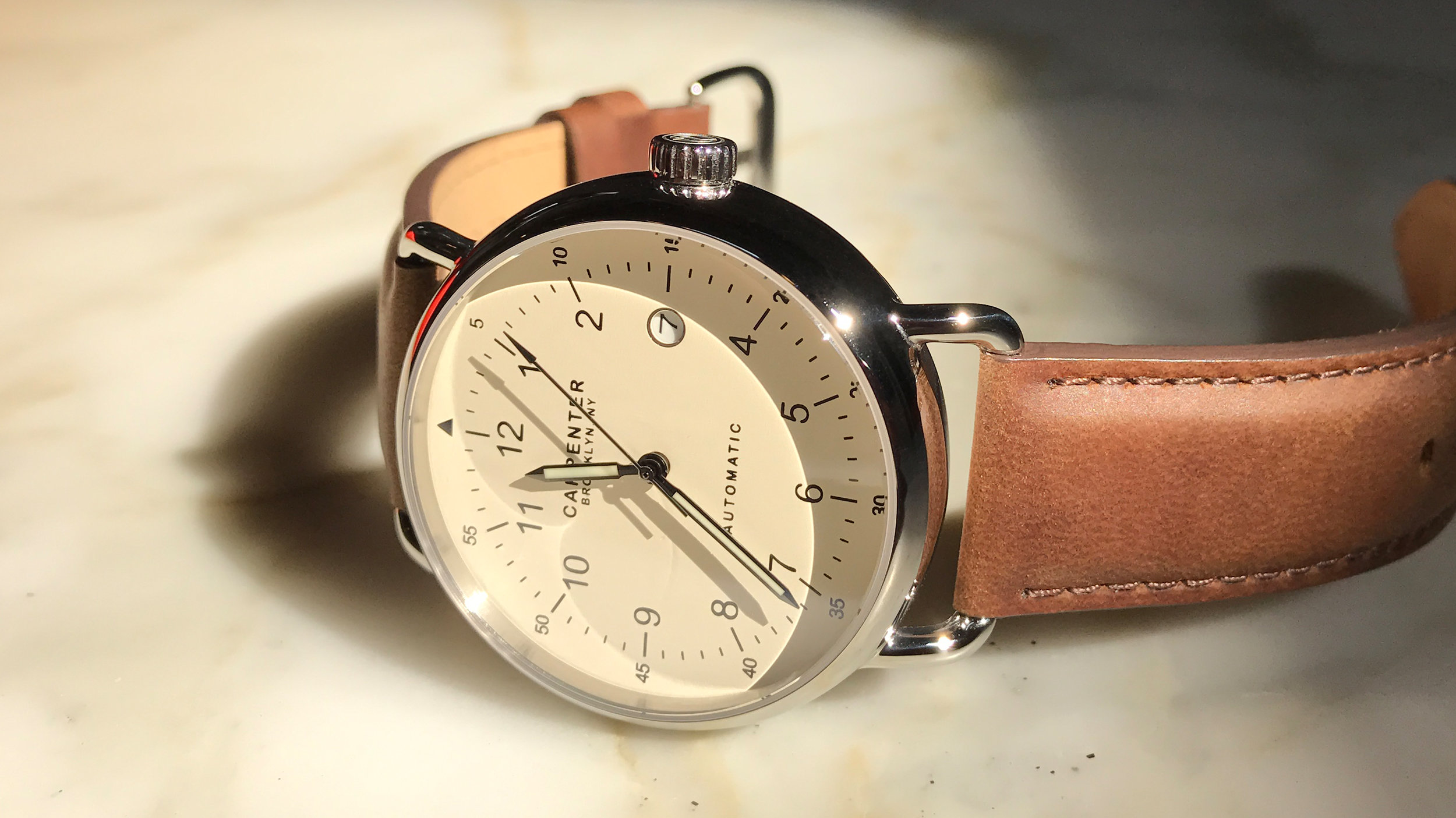
The CMF (color, material, finish) chosen for this model is absolutely flawless. It has a brushed stainless steel case with a malt-colored leather strap, but what brings it all together is a cream colored dial with white and red accents on the face’s layers. The rugged ribbed crown screws securely in place after adjusting time, and the start/stop chronograph button has a red accent with a corresponding red second hand to match. The lens features a concave surface which is rather uncommon since it likely means the whole watch has to grow at least 1 mm in thickness. Nevertheless, it is unique and oddly satisfying to run your finger across the smooth bowed surface.

As you may have assumed from the photos, this watch is physically substantial. It won’t tuck easily into a snuggly fitted shirt cuff and is not for those that prefer a slim lightweight watch. It is heavy, and at times it can feel uncomfortable because the butterfly clasp can dig into your wrist. This happens because the watch is large and the whole piece is especially rigid due to the way the formed strap exits the case. But I don’t care how thick and rigid it is. I don’t care that it is not the most comfortable watch ever made. I just care about a distinctive quality timepiece from which the industrial design will stand the test of time. The Nike Heritage does that in spades.

FINAL_Red dot.jpg

07: CARPENTER by Damien Vizcarra

Carpenter Watches was founded in 2013 by Brooklyn-based industrial designer Neil Carpenter. Each watch is automatic, powered by a Miyota 821A movement. There are four different color variations and all of them are handsome. I opted for the M1 Brooklyn Field which has a cream colored dial housed in a polished stainless steel case. At first glance, there is something strikingly familiar about the watch. The M1 harkens back to a WWII era aviator appearance.  It is straight-forward, simple and utilitarian with form and visual cues that are reminiscent of an explorer's compass or a vintage military-issue field watch. Although the finishes, details, weight and materials elevate its quality far above a retro-inspired fashion watch. The overall shape is a clean round puck with a dome sapphire crystal lens that makes the entire form soft.  The lugs look like a craftsman hammered steels dowels into shape, welded them onto the housing, and gave every piece of metal a few hours of polishing. To neutralize the mirrored finish are muted, natural brown leather straps that feel substantial because of the layered cut-edge construction. It all comes together to feel handmade and bespoke.

The word 'Brooklyn' proudly takes center stage on the dial along with the brand mark, and the watch does look distinctly American.  In terms of timepieces, if Switzerland and France claim luxury, Germany claims utility and legibility, and Japan claims function, then America claims craft. The kind of craft from which the country was built during the turn of the last century.  That craft then thrived through the mid-century, but had a woeful architecture and design period through the 70's whose relics I try to rinse from my memory. Fortunately, craft in the US started to return around Y2K and has been getting stronger ever since. Craft now even takes the form of societal movements: maker movement, craft beer, handmade soft goods and accessories, artisanal food, local sourcing and rough lux interior spaces.  Craft is most certainly having an influence on contemporary industrial design, even as the world grows more digital (perhaps because the world is becoming more digital). This brings us back to the where we are with the design of goods like the Carpenter watch. Appropriately, New York and Brooklyn are places where you can still see some genuine artifacts from that industrial era.  You could find subway tiles, brass trim, brownstone architecture, clubhouse leather, pillars in open spaces, and weathered wood trusses long before bearded hipsters tried to claim the look or Restoration Hardware made it a thing.  Carpenter watches is not trying to inauthentically replicate that aesthetic. Rather, they have skillfully manipulated enough visual elements to capture some of that romance while establishing an identity of its own.

I discovered Carpenter watches on a design blog and noticed that they had a robust following on social media before selling a single unit.  As mentioned in my previous review, supporting new brands on platforms like Kickstarter is a win/win.  There was plenty of demand and built anticipation in Carpenter's case which is an enviable position to be in when you’re ready to put your product out for pre-order.  I can imagine there was probably a healthy amount of pressure on Neil when followers kept hounding, "When will these be available to purchase?", "Are these ever gonna be for sale?"  I quietly marked my calendar for the pre-order date and hit the pledge button once the campaign started.  I was #001/175, as marked on the watch's case backing as well as an etched black card included in the watch's wooden packaging.

In all, the Carpenter M1 watch is a fine, warm, well-made gentleman's watch that would also look pretty hot on a woman's wrist.  The design is simple, but getting simple just right can be incredibly deceiving.  I'm not sure if I should leave it pristine and flawless to retain its value even though I'll never sell it. Out of the box it is too nice to bang up, like a new car without any dings.  But if that new car is meant to drive through a safari then it is a crime to have it sit spotless in your garage. This is the type of watch that is meant to show the signs of all the places it has been and is made of the right quality materials to do it gracefully.  I guess I have my answer right there..

06: KLOKERS by Damien Vizcarra

In September 2015 I pre-ordered a KLOK-01 on Kickstarter from France-based Klokers watches.  After wearing mine for a few months, I am finally ready to write a review.  The timepiece is based on an interchangeable watch module that is meant to pair with a variety of accessories within an ecosystem.  The idea is to change straps, chains or pouch to suit your mood, and to buy more accessories of course.  I kept it simple and have decided to stick with the indigo blue leather strap to match the white + dark blue dial.  The dial design is a series of three concentric discs indicating hours, minutes, and seconds.  Whichever numbers fall within the vertical line from center to 12 o’clock tells you the current time.  The KLOK-01 does a better job than most other concentric dial watches since many of those have the timeline in weird counter-intuitive places, like at 9 o’clock.  The graphic face on this watch is inspired by an old school concentric slide rule.  I love it when products use visual metaphors tastefully. The result is a very technical, mathematical look that fits the watch since time itself is a unit of mathematical measurement.

The technical look carries onto the back side of the watch module, which uses a combination of surface finishes (brushed, polished, cast), exposed hardware, and precision markings (laser etched, machined).  The back side of the casing actually looks as good as the front and it feels secure when it is attached to the latch mechanism on the strap. It gives a really satisfying click when you attach the watch module to the latch.

I ordered my KLOK-01 early in the Kickstarter campaign, so I received a relatively low number, #43.  I think it’s a nice touch to make editioned versions of products. Aside from the fact that crowdfunding helps small companies launch products, investing early usually means getting the product before anyone else and at a lower price… win/win.

Visually, there is a lot more going on than the press photos lead you to understand, but it all comes together nicely.  The dials have perfectly even spacing between the concentric hour, minute and second discs, and the lines on the entire readout all match up as it rotates thanks to a Swiss-made Ronda quartz movement.  The vertical timeline marker is located on a magnifying lens that runs from the center to 12 o’clock. While the transparent lens doesn't actually magnify very much, it does give the watch face some additional optical depth.

The only real issue I have with this timepieces is its lack of heft.  The watch has good, substantial proportions which is 44mm in diameter. Couple this with the fact that it sits on top of the strap and you form an impression that it would be heavy.  Physical weight in this case would have equaled quality, so the fact that it is so lightweight relative to its scale almost makes it feel toy-like when you pick it up. Some metal parts feel plated (they describe it as metal-polymer composite) vs. all stainless steel or aluminum which is what I am accustomed to getting for a watch in this price point.  When metal parts are not cold to the touch, that usually means the part is plated.  This, along with the fact that the clear lens is a polymer vs. a mineral or sapphire crystal makes me concerned about its durability.

Overall, the KLOK-01 is a handsome and unique timepiece.  The dial is easy to read and people think it is an interesting piece because of all the numerals on the face.  This particular blue color combination works well, and my concerns about durability are mostly remedied by the fact that if you are as obsessive as I am about not scratching or dropping your watch, then you should be fine.

05: APPLE WATCH by Damien Vizcarra

I am less than 24 hours into owning the Apple Watch.  During my anticipation of finally getting my hands on it I, like you, have read a ton of reviews about it.  Most audits cover its utility, the high price tag, predictions on its success, implications on Switzerland and so on, but I haven’t read much about its industrial design.  

In this post I won’t dig too deep into the user interface; I haven’t lived with it long enough to talk knowledgeably about its utility.  And I definitely won’t talk about cost.  Its value all depends on what the buyer is expecting to get out of it and how comfortable one feels about ponying up this kind of money.  Clearly it is not for everyone, especially people who don’t care for watches or early adoption in the first place.

I tried to review the Apple Watch as a watch collector, but I really couldn’t help myself from looking at it through the lens of a professional product designer.  I’ve been designing for 12 years.  I know how difficult it can be to carry a vision through from idea to sketch, sketch to embodiment, and embodiment to final product. There are endless opportunities for that vision to fall short when key features get cost cut, materials get compromised, or companies let focus groups decide what’s right for the market.  The Watch proves once again that Apple takes no shortcuts on the care, quality, detail and execution of its hardware.

Why not round?
The shape seems to be a little controversial for watch traditionalists.  Some people think it looks like a small iPhone or that round dials look better on watches.  First, opinions on the aesthetics of anything (people included) are incredibly subjective.  While nearly all of the watches in my collection happen to be round because I also think it looks good, I would have been really disappointed if Apple made it just another circle.  Round is such an expected shape for a watch.  One of the goals of this watch is to transform the category of wearable products.  From a hardware perspective, you don’t stand out if you look like everyone else.  The soft-shaped square is a visual language that currently personifies Apple.  It just make sense to own it, run with it, redefine it and tell people that this is what a watch should be.     

It's not that big.
I was surprised that the watch isn’t as big as it looks online.  Last September, my design studio gathered around a projector broadcasting the Apple announcement onto a large wall.  The general sentiment was that the close up, larger-than-life images made it look really thick.  In real life its proportions are no different than what you would come to expect from other timepieces.  It is comfortable to wear, sits on the wrist no higher than standard watches, and the screen of the 42mm version is just the right size to do the type of quick navigation that you are expected to do with this piece of hardware.  Even if a user is second-guessing the utility of its function, they cannot deny its craftsmanship.  Not too many companies in the world can pull off this level of quality at this scale.  Of the small handful of watches in my personal collection that match this level of true craftsmanship, material, and build quality, there are less than 10,000 units of each of those particular models that exist in the world.  It can be done in small production runs, but it is very hard to do in the scale of millions.


Luxury Packaging 2.0
There were several reviews about how the packaging fell short of luxury expectations.  It’s tempting to compare the box to other luxury watch packages but it’s a flawed comparison because it is fundamentally in a different category despite sharing the description of a “watch”.  The Apple Watch comes in a subtly branded, thick, glossy white plastic box with a soft fabric interior lining.  It is nice enough to keep, repurpose, store the watch in, or even grow a small plant in it.  Conversely, it is not so needlessly precious that someone would feel wasteful or bad about throwing it away.  Just because a watch costs $1000 doesn’t give it permission to be gratuitous for luxury’s sake.  Other lux watch brands do it because it is the way it has always been done and I’m sure it makes some customers feel special about themselves.  But Apple’s packaging is well-staged, smart, simple, and is giving “luxury” a paradigm shift that is long overdue.  So I wonder what the big deal is.  In 2015, is the definition of luxury packaging really still stuck in the old world mentality?  Polished wooden boxes, velvet-lined interiors, antiquated clamshells, or watches wrapped around miniature silk pillows?  Some of the higher end timepieces that I bought were presented like this…yawn.  I thought people knew that when they are buying an Apple product they are buying into the notion that they are getting something that will help guide them into the future.  That means that what they get will be inherently different.  Innovative design is not supposed to be the same as it has always been.  Different can be a little uncomfortable, somewhat unrecognizable, and can take people time to get used to.  Different warrants people questioning a new product’s function, its presentation, its value, and it should prompt questions because new and different sometimes just doesn’t work.  In this case the Apple Watch, and wearables as a whole, will eventually become mainstream as technology improves.  When it finally does, people will question and criticize the utility and form factor of whatever comes next because it won’t be like the smartwatch that they have been wearing for the last ten years.

Ultimately, the Apple Watch is a small computer that takes the form of a watch.  The design of the hardware happens to be very well done.

Makes navigating LA a little less dreadful.  The Apple Watch with Link Bracelet comes with a soft pouch for removed links.

Makes navigating LA a little less dreadful.  The Apple Watch with Link Bracelet comes with a soft pouch for removed links.

The Apple Watch makes me the coolest uncle ever.

The Apple Watch makes me the coolest uncle ever.

04: IKEPOD by Damien Vizcarra

When compared to retirement plans, stocks, bonds, real estate, and some vintage cars, watches are not known to be a great investment.  This Ikepod Megapode MG04 is definitely an exception to the rule.  Only 9999 were ever made.  It is so pristine and rare that I've been reluctant to actually wear it for fear of scratching/damaging it knowing full well that repairing it would be a nightmare since it has been out of production for some time. But recently I adopted a "you only live once" attitude and decided to take it out of the box, put it on my wrist and go. How liberating. Here are my impressions.

Fit:
The diameter is 46mm, and it is the largest watch I have. Although it doesn't feel or look that big because the continuous disc shape is soft, round, and whatever hard edges other watches have all fall away which makes it seem smaller than it is. The Megapode is actually comfortable, but putting it requires some serious dexterity because you need to thread the rubber strap through a thin opening to secure the post.

Materials & Design:
Marc Newson is the designer of this piece. He takes no shortcuts when it comes to use of material or sophistication of design process. The casing is constructed of solid titanium, machined to drop in the ETA/Valijoux 7750 movement from the front. As such, there are no partlines on the rear of the body. Only a small, space-portal type window that lets you see the movement's beating heart. The brushed finish on the titanium is super fine, almost like a needle was used on the lathe. The result is a deep sheen that has a satin-like quality when you rotate the watch and catch surface reflections. The domed sapphire glass completes the unified form. It is so pure and clear that it doesn't even look like there is glass in some pictures. I don't know how they attached it to the casing, but it is clean, seamless, and beautiful.  As for the dial, it was designed for pilots and is intended to enable precise calculations for fuel efficiency, duration, distance, weight, etc. I have no idea how to use any of that, so I keep it old school and just stick to reading the time.

This piece is undoubtedly the big daddy in my collection.  It's like a work of art that could live the rest of its life on a pedestal, but then I wouldn't enjoy it. Whenever I wear it, one of two things happen: 1) nothing. It goes complete unnoticed, or 2) people say, "is that an Ikepod? I never actually seen one". There’s a sense of awe for those who recognize what it is.  Now I have the task of making sure it stays mint so my boy can wear it someday.

Cruzzie, baby, one day this will be yours :)

03: 4th DIMENSION CONCRETE WATCH by Damien Vizcarra

Analogue watches have been around so long that it's hard to imagine finding one that doesn't resemble something that has been done before. The 4th Dimension watch by 22 Design Studio is truly iconic and unlike any other.  The Taipei-based design start-up was established in 2005 by designers Sean Yu and Yi-Ting Cheng. Their curious approach around experimenting with unconventional materials quickly landed their products at MOMA.  The watch is striking at first glance. What makes it so visceral are two important attributes: 1) the element of surprise, and 2) poetry. The element of surprise comes from the fact that the dial is made of concrete. It's such an unexpected material to use on a timepiece yet it looks light, architectural, even delicate. The poetry comes from they way they handled the concrete.  They use the metaphor of a spiral staircase. On the face there are twelve steps. Every step represents an hour, and every hour that passes is an upward step.  It's a lovely interplay of story, depth and shadow.  When it all comes together the simple materials unify perfectly.  The concrete is substantial, the bent copper watch hands feel industrial, the brushed stainless steel looks solid, the bolt-like crown resembles raw hardware, and the cognac leather looks like it will only get better with age. It transports you back to the turn of the century during the industrial revolution, but then you're reminded that you've never seen anything quite like this before.  

I bought mine online from GSelect in Brooklyn (http://shop.gessato.com/). They are one of the only places in America that carry it. I pre-ordered early and I was happy to learn that I was the first buyer in the US to own it. When I wear it I sometimes get, "that's cool", "that's concrete?", and "how did they do that?".  The watch has proven to be a fun conversation starter.  In the buying process I discovered the full gamut of tasteful artifacts that Gessato/GSelect carries. This, along with quick, friendly correspondence makes me highly recommend this shop if you're in the market for something artful that none of your friends have yet.


02: BRAUN by Damien Vizcarra

I met Dieter Rams on Friday, April 19th, 2013.  I was invited by Art Center College of Design to attend a panel discussion with Dieter before he was to deliver his commencement speech the following day.  This was the perfect excuse to buy this beautiful grey Braun watch that was designed by Dietrich Lubs while Dieter was Chief Design Officer.  I could easily write a 5 page essay on all the ways this watch is perfect, but the best description comes from Rams himself:

Good design is innovative
Good design makes a product useful
Good design is aesthetic
Good design makes a product understandable
Good design is unobtrusive
Good design is honest
Good design is long-lasting
Good design is thorough down to the last detail
Good design is environmentally-friendly
Good design is as little design as possible

Dieter Rams wrote the Ten Principles for Good Design in the late 1970’s and they have been the guiding philosophy behind his designs and the work done by Braun.  During the panel discussion, a designer in the audience highlighted the fact that the Ten Principles were written 30+ years ago and asked Dieter if he considered changing or adding to it.  Dieter, with his distinct German accent, cleverly responds, “I thought a lot about that recently and…(long pause)...NO”.  The crowd delights in his answer.  He didn’t say this to defy change, nor did he say this to live up to his persona.  He qualified his response by describing that these Ten Principles embody the change happening modern in design.  There's no arguing that qualities like honest, unobtrusive, innovative design transcends product categories and will always be relevant. Some, like environmentally-friendly, are actually more important now than they ever have been at any other point in history.  Others, like “as little design as possible” and “thorough down to the last detail” illustrates why Jonathan Ive was influenced by Dieter and himself created Apple products to be experienced in a way that reflects these universal principles. They are the perfect blueprint. This watch is just one example of it.

Dieter Rams signing my copy of Less and More (left).  My friend Thorben Neu is just hangin' with Dieter.  I love this pic (right).

Dieter Rams signing my copy of Less and More (left).  My friend Thorben Neu is just hangin' with Dieter.  I love this pic (right).


01: UNIFORM WARES by Damien Vizcarra

The first tip of the hat goes to a brand called Uniform Wares.  Founded by designers Oliver Fowles and Patrick Bek in 2009, Uniform Wares is a UK-based company that “designs and produces timepieces based around a philosophy firmly rooted in contemporary British design and engineering.”  The most noticeable element that unifies their offering is a clean, minimal, detail-oriented aesthetic.  I’ve seen so many examples of minimal watches, but either they feel like they’ve been done before or they are so minimal that they lack soul. Uniform Wares doesn’t have that problem.  They managed to make the pared down detailing feel distinct and recognizable, and their sophisticated color palette makes it difficult to decide which one you want to buy. The 302 and 100 series (pictured above) are great examples of refinement through restraint.

I acquired most of the timepieces shown here directly from Uniform Wares.  They were quick to respond to my questions, always provided great service, and honestly I think I just like the British accent.  I need to find a place I can go where they appreciate the American accent.  You think it would be in LA because no one here speaks English, but no…

In short, Uniform Wares is destined to be a classic.  A modern vintage.  They create the type of timepieces that when you look back years from now you will regret not buying one when you had the chance.

http://uniformwares.com/

The floating Uniform Wares photo was taken in the former office of Charles & Ray Eames in Venice, California (now Continuum LA).  That’s me with my hacked, scrappy photo studio.  Also, a nice shout on Instagram @ #uniformeverywares dur…

The floating Uniform Wares photo was taken in the former office of Charles & Ray Eames in Venice, California (now Continuum LA).  That’s me with my hacked, scrappy photo studio.  Also, a nice shout on Instagram @ #uniformeverywares during a visit to our space at 901.

WELCOME by Damien Vizcarra

Thank you for visiting my watch blog.  Allow me to begin with what I am not.  I am not a WIS, a brand name luxury watch snob, or an expert on horology.  I tend use my iPhone to check the time as much as I do my wrist.  But as a designer, I appreciate examples of great design in the world and love to see it when people get it right.  One product category that always interest me is timepieces.  It has been fun to watch (no pun intended) the evolution of timepieces from analogue to digital, automatic and quartz, to USB-powered smartwatches that have more to do with data and feedback than they are about merely telling time.  As 'wearables' begin to take shape in our society right before our eyes, one thing is becoming clear.  The immediate future of wearables will not be about a piece of glass in front of your eye.  Rather, it will be kickstarted by useful, beautiful, well designed machines on your wrist.

Throughout the course of the year I'll be sharing my watch collection. I will tell you a little about them and in some cases the adventurous backstory about how I got them. You'll generally find a few things that they all have in common: all are minimal and clean in design, they all have great proportions, are constructed in interesting ways, use refined materials and colors, and each and every single one of them are timeless.  Some of these timepieces are fairly common, relatively inexpensive and still in production. Others are very rare, iconic, and have their place in design history.  Many are part of MOMA and Cooper Hewitt's permanent collections.  I am not interested in watches as fashion accessories or as shallow status symbols. As such, if you are the type of person that fancies yourself a connoisseur based strictly on price-tag or lux brand name, then this isn't the blog for you.

Stay tuned and enjoy!